
Saturday, 30 September 2017

semiotic icon,index, symbol blog task

Image result for snapchat icon
Image result for instagram icons Image result for whatsapp icon ios7

These are all icons which represent different social media and everyone knows which each of these are related to as they don't have to learn them. These icons are used deliberately to represent these social media because they have different elements that make them in use for the medias as for the Instagram icon there is a picture of a camera and the whats app one has a picture of a phone and message box around it which lets the audience know what it is representing.  

Image result for adverts

This advert is promoting chocolate which we can see from the advert itself there are icons index and symbols within it which let the audience know.

Icon:
The icon within this advert is the chocolate itself as it is what is being promoted and represented as it is signifying the product and depicting this fact.

Index:
The index within this advert could be the Oreo cookie as it representing the chocolate and we know that will be the flavour of this chocolate so the audience will know it is not plain but it has a different flavour.

Symbol:
The symbol of what is being signified could be the cadbury sign and the glasses of milk underneath giving a suggestion that this is cadbury milk chocolate so it could make a connection with the packaging of the chocolate which is the signified and the chocolate itself.
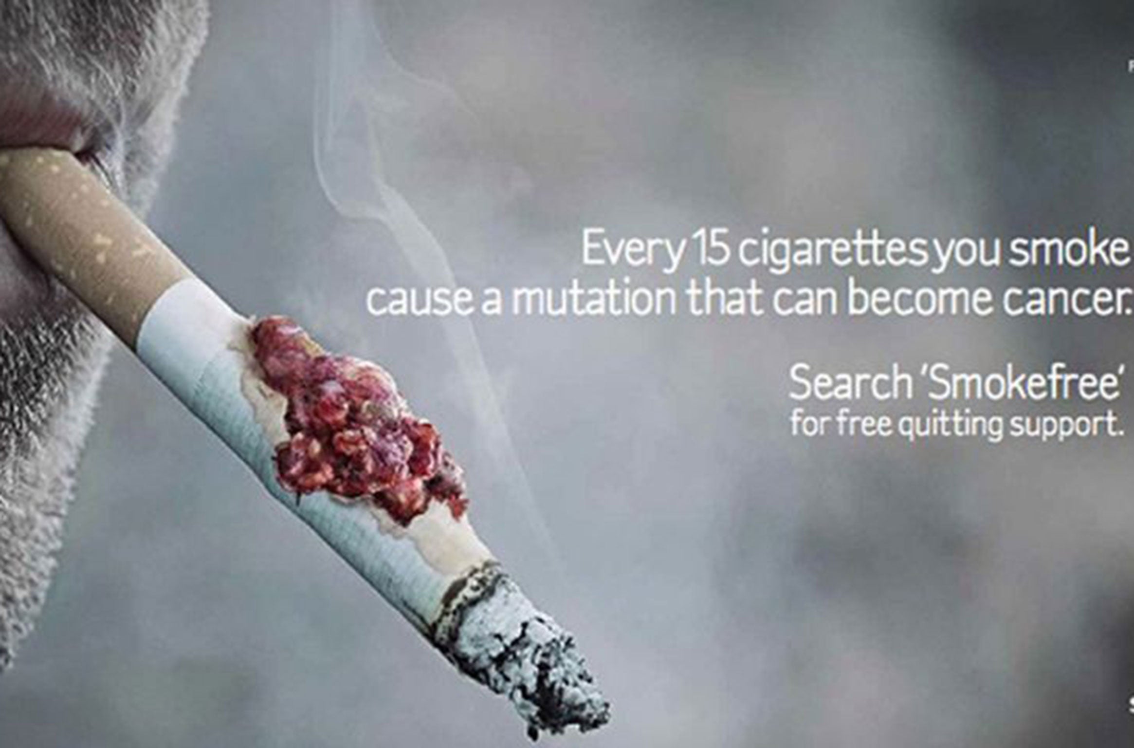
Image result for adverts

Icon:
The icon of this advert would be the cigarette and letting other people know the side effects of it.

Index:
The smoke within this picture could be indicating suffocation and fire which could be harmful for your health and it could also be portraying fire and as the cigarette also has something on it indicating it is harmful for the health.

Symbol:
The symbol could be the the damaged lung on the cigarette as it could portray the side effects of smoking and these could be very injurious to health.

Image result for adverts 2017

Icon:
The icon within this advert is the Dior perfume which is being represented and promoted to the audience.

Index:
The women could be representing the perfume as she is being the signifier to portray the perfume is a seductive way which could imply the fact that its a feminine perfume and is aimed at women.

Symbol:
The fact that it says '' Miss Dior'' could also be the fact that its a very formal type of perfume and portrays the class and modesty of it through the formal language it displays which could question the ideologies.
Related image
Icon:
The icon of this advert is the drink that is being represented and it is depicting that it is very healthy and nutritious.

Index:
The index of this advert could be the quote which could be representing the energy it gives to the audience and motivation through this drink and how it is vital for old people as it could make them active and energised. This is a good signifier representing the drink.

Symbol:
The runner could be representing the energy as well as we know this is a culturally learnt thing and we know that people who jog and stay well maintained are the ones that are healthier so it could be signifying the drink through this.

Image result for water adverts

Icon:
This icon is the type of water which is being promoted within the advert an is resembling the other pictures within the advert as well.

Index:
The person which is shown is made out of water which could suggest that most of our bodies are very dependant on water and it also generates our bodies.

Symbol:
This could be the name of the water company because you wouldn't know its a company of water without seeing it on the water bottle so it resembles the signifier.

Image result for nike adverts
Icon:
This adverts promoting the ball so the icon is the ball within this advert which Nike has represented.

Index:
The index within this advert could be the quote as we know the ball is being represented it has portrayed it as the best ball.

Symbol:
The Symbol within this advert would be the Nike tick as we know it representing Nike and this company is well known in most of the cities.

Image result for makeup adverts
Icon:
This adverts icon is the lipstick as we know  it is being presented through the colours and it is there within the advert to catch the audiences attention and this makes the audience also more interested.In this case the signifier would be the red lipstick.

Index:
The adverts index would be the lips which have portrayed the colour on it showing the image and how it would look on a women making it seem seductive and mesmerising for the audience and this signifies the product itself.

Symbol:
The symbol of this advert could be the flower representing the beauty and passion behind the image and shows the seductiveness behind this advert and this also shows that there is no connection between the signifier or signified which means it has to be culturally learnt.
Image result for women adverts


Icon:
The icon of this advert would be the lucozade as it the thing being promoted within this advert and
we can also see it so it is being signified.

Index:
The Index of this advert is the quote as it is signifying the new drink but the fact that it says ''omg its pink'' could be seen as a literal stereotype for this advert as it isn't really indicating anything.

Symbol:
The women within this advert could be seen as the symbol within this advert because she isn't really resembling anything maybe because women are more associated with colour pink the producer may have chosen to put it there but this makes it seem very stereotypical.


Related image

This is one advert which could be interpreted in various ways in my belief this advert isn't very good at advertising the need of quitting to smoke because it doesn't show this clearly. For example the picture of the child smoking is very controversial no one would really make their child smoke and even if they do they wouldn't do it when there child is around furthermore the audience aren't really sure what the advert is saying to its audience whether you should quit smoking or whether you become a vegan even though, there are symbols portraying this like in the bottom right hand corner of the advert it is literally saying to go vegan. The index within this advert which is represented is the smoke which could be resembling the suffocation and the harmfulness that smoking can create. However this advert is not literal and not direct to the audience so this advert could be seen as confusing and men nothing to some people. For example we could say that the producer has used the baby in this scenario but it isn't very interesting for the audience has it has portrayed a very controversial image of this child.


Image result for successful adverts makeup

I think that this advert is a very successful one as it has represented and portrayed this mascara in a very creative way the fact that the icons,symbols and index are used in a very smart way. For example the flower is the symbol in this advert in particular as it isn't representing anything but it makes sure it adds to the beauty of this advert it makes it more filled with passion and seductiveness for the audience as the colours are vibrant and bright adding to the semiotics of this advert. All adverts are seen has polysemic which makes them harder for everyone to interpret in the same as way as some people's interpretations are different. As this advert also conveys beauty through the women's face this could be the index as it acts as a signifier towards the audience. Furthermore the symbol could be the quote and the sayings within this advert as they portray the icons through a positive light and intrigue the audience about this product being used which means it is a could signifier towards this product.


Wednesday, 27 September 2017

Reception Theory


Dominant Preferred and hegemonic reading:

 From this advert i can that this is a Reebok advert that is mainly trying to inspire its audience and and 50 cent is acting as a role model to other people in reference to the quote ''i am what i am'' this motivates people as it is in a Gothic font which could mean that life is timeless.This is all promoted with the use of the brand through identity and liberty.


Negotiated reading :

The main point about this advert is that the media reinforces this particular black ethnicity to be more related to crime which is stereotypical in society because of the connotations different people interpret from it and this creates the myth and makes the adverts and all sorts of media polysemic
which contributes to the different opinions of how everyone views this certain image. Alternatively this advert could also be seem as more positively than in a negative way as it could be countering the hegemonic reading and celebrating criminal-ism. This advert could be be more right wing as their could be beliefs could be about economic freedom and how businesses should not be regulated and freedom and success over equality because this advert has used direct mode of address indirectly directing it to the audience by using both quotes in very different fonts and telling h audience to be more determined and this myth that has been created around this advert could be built up as it all becomes natural to society and potentially even make an impact in people's lives. These elements all depend on how the individual view this advert as they are polysemic and not everyone has the same interpretations of these adverts which could create a gap between the directors intentions of this advert and the audiences interpretation. 


counter hegemonic reading:

This advert could be promoting criminal-ism but the individual perspectives could be different as the producer may intend to make this advert to promote inspiration and identity but others may not view it this way as they may see it negatively because they may think this is stereotypical as a certain type of ethnicity has been used (Black) rather than any other racial group so they may think its is directing only towards them and this could be a signifier within this advert as it is doing the communication and promoting this idea and may not passively get accepted in society.


Image result for adverts to analyse

Dominant Preferred and hegemonic reading:

The producer has created this advert to promote these pop chips as being healthy and nutritious for yourself and not too fattening as Katy Perry is portrays holding two bags and this bring out the idea that these pop-chips can be eaten as much as you want to eat them so this could be the key intention of the producer could be to advertise this.

Negotiated reading :

As this advert portrays the pop chips the headline give us much more to think about as it mentions the ''love with the handles''. which makes the audience interested and read the name of the object being promoted because they would think that it is fat free and because there is reliance on Katy Perry which the producer would have purposely done to make it seem more realistic and promote these chips as a healthier option to normal chips and the fact that it indirectly talks about the fat on the body and keeps referring to no fat on the body as it mentions underneath '' good thing they don't go straight to my hips'' which gives us a idea that these pop-chips must be less fattening for everyone which is what is the good thing about this product and why it is being promoted. However adverts are seen to be polysemic because not everyone will have the same interpretations as some people may believe it is centralised to mainly women as they are thought to be fit and maintain  their body weight and some women may argue against this matter and why there is no man present within this advert as it could be directly centralising women.

counter hegemonic reading:

The idea that this advert is going against women's size and body weight could be objectifying them and could bring out the fact that instead of promoting this product in a respectful manner it could be going against women. This makes it seem to overcome the temptation of always staying healthy but everyone may not see it like that as people may have different interpretations of this advert.

Do these adverts provide evidence for the idea that audiences are free to interpret messages in a variety of ways - including rejecting them?

I believe that both adverts convey the message that is trying to be said to the audience in a rational way however some people may interpret these in very different ways as the adverts are seen to be polysemic which shows the different aspects of these adverts. Both adverts provide evidence for the audience feeling free to interpret their message as there is no direct mode of address directly saying anything which conveys the idea that they are less controversial then they appear to be. For the first advert i believe that there is a idea to portray the advert in a way to make the younger generation more motivated and determined within themselves independently but this may also bring out the fact that the media could be reinforcing the idea about one ethnicity being involved in all these criminal activities and this may offend some people and bring out more of a negative response from the different audiences. In addition to this the second advert also portrays difference elements of these negotiations as you can interpret in different ways the advert does allow you to do that as it. As this advert refers to size and weight of women particularly linked to the junk food  and making these pop-chips seem healthier and show them in that way makes the audience want to buy these pop-chips as they feel like it would be a better option is resisting the temptation of other junk food. These aspects of portraying the pop chips like this make the audience interested as Katy Perry is holding it making it more centralised and seem like a amazing product.This advert may be interpreted as a positive one or a negative one in the sense that it could just be literally saying that these pop chips are very healthy and they are less fattening or it could be objectifying women and centralising this particular advert to them directly and argue why there is no man present so it could be a stereotypical advert that has been portrayed in the media. This is what may get some people to go against this as just like the first one only one ethnicity has been shown it may be that the producer is showing it in a positive way to make black people seem more inspiring or in a negative way to make their ethnicity seem more criminalising which may offend some people and argue against this particular advert as it seems more stereotypical. Therefore both these adverts show the negotiations and counter hegemonic reading in both these adverts.

Tuesday, 19 September 2017

Advert analysis homework

Related imageThis Magazine is mostly considered as one that promotes fashion and from this we can see a picture of a blonde haired women that looks glamorous and alluring to the audience from this i can connote that it is emphasising femininity as she is also wearing a blue dress and has a big smile on her face promoting beauty to its audience. As we know that this magazine is best known worldwide and has beauty trends from all over the world it is very well known so it is important to point out that Vogue magazine is international, so it presents fashion news from all different countries and the informative articles on beauty trends all over the world.The purpose of this magazine is to create a world of beauty and fashion with its own rules and style of life Vogue magazine presents a kind of religion that is aimed to form a society with certain tastes view points on beauty and fashion to influence women's lives. I think that this has been achieved as nowadays most women all over the world read vogue magazine and also follows its religion so that it proves the claim of glamour and fashion. So from this we know the target audience are women for this type of magazine as the title is a orthodox ''Great American Women'' implying the power and authority women promote through this magazine.

The colours used within this magazine are also like pink for the typography emphasising on the femininity again and it is also big and bold and is a sanserif font so it  can appear as being more sophisticated as the colours would intrigue the audience and the colours are used in various high end fashion magazines.As this magazine is mainly promoting fashion the way that these pictures are framed and positioned is in a certain way to make us have a different aspect of fashion for example the women standing with hard lighting hitting her and making her look as if she has  confidence, womanhood, and the qualities that every women desires so this women promoting that makes the magazine look more desiring. These are the Mise en scene aspects of this magazine cover and in addition to this the composition of the women is close up and it is not a long shot as it portrays her looks and appearance more closely so that women can get genera idea of these womanly looks and the women's picture is also he biggest from all the other texts on that magazine suggesting it is classy and from high end in fashion as there is no slang used in this cover of the magazine which makes it seem more upmarket and fashionable towards the audience.

This type of magazine would be bought by people who seem to be wanting to fulfil their needs and as this magazine has great sophistication in promoting the fashion and trends worldwide and it is a international magazine it imposes this idea more easily.  For example the idea that the women is standing makes her more appealing and the pose and structure her looking contented makes the audience more interested.


Monday, 18 September 2017

Analysis on RBK 50 cent Advert

 This advert is more of a inspiring one which could be for the young generation and give some sort of inspiration to them, as from the advert we can read the quote that could be giving a desire to achieve something and in order to achieve it you shouldn't wait for your goals to come to you and it could mean that you should work harder and put your best in everyday to reach those expectations and values.The connotations of this advert could relating to mise en scene as the person in this image is serious is a signified within this advert and portrayed in a momentous way to give the audience a more dominant feeling. There also could be juxtaposition between the two backgrounds of the advert as there is fingerprints which could mean its also crime related and behind him its all black and the advert is completely monochrome there is no touch of colour which could suggest there is elements of power,authority and strength. The typography could also suggest that this is more historical as the font is Sarif giving it a traditional touch and once again linking to the dominance and power related themes and also by giving this desaturated element it intrigues the audience even more especially the younger generation as we can identify that this could be promoting the brand and by making it look more characterised by the inspirational  quotes which gives the audience more interest to look at this advert. The composition of this advert is arranged systematically as the male in this advert has been centralised giving it more dominance within this advert.

Furthermore as this advert is monochrome it can get consumers o focus into the advert more as these colours could relate to professionalism and power and authority. This advert has photos of a man who's image has been centralised and the fingerprints given at the back of the quote and could mean its promoting the brand but focusing on  more of a black ethnic minority as they are seen as more cool in society and this gives a more deeper thought of the dominance that is signified within this advert and the central image which has helped the audience to identify this power related theme within this advert. The mages within this advert are quite big compared to the text to give it a main focal point for the advert itself.  However the quote on this advert is much more smaller compared to the catch phrase ' I am what i am' which is more bold and historical and relates to more of a traditional font rather than modern which could signify potential and the fact that the picture within this advert is close up makes it even  more focused and intrigues the audience as a whole as the person is shown in a stern and serious light and it also at a side angle which shows more light into the eyes and upper part of the face which could connote capacity and ability and mise en scene is use d here very well as the lighting is only on his face which brings the attention on him and makes him stand out. In addition to this as the background is plain it could also mean there is even more focus on him as the background is not too flashy or distracting it is just plain making him the central image of this advert but the setting is not seen here which could means they had other priorities that helped them sell their product. The fact that this photo is taken and is shown in this advert could be because it works well as 50 cent is a very well known person so they have decided to focus on him persuading the audience to buy Reebok products.

Friday, 15 September 2017

Textual Analysis


Related imageThis is a poster advertising a certain type of lip Balm from Maybelline from this poster we can see certain colours and aspects have been used to portray the Lip Balm in a special way, from advert poster we see the conventions which are the Bright and Dull colours used which bring out the colour of the Lip Balm which is Bright yellow which is the pack shot of this advert as the audience (Women) would see the image of the object last which means that this is the central image of this advert to present it in a certain way. Furthermore the headline which is used, ''no more basic lip balm'' which suggest to us this pun is used advertising its uses to engage the audience. Also this commercial is particularly aimed at women which means it would intrigue women more and make them want to buy this product. In addition to this  the fact that the women's picture is grayscale and the lips are signified in a particular shade which makes it look more captivating to fascinate the audience. This type of advert could be seen in magazines, bus stops or in front of a cosmetics store as they want the product to be sold as much as possible.

The values and beliefs that challenge this media is how society actually portrays women as we can see from this advert the women appears in a monochrome shade and the lips are not desaturated showing the centralising bit of the image which would appeal to the audience and this would really get them to focus on that. Furthermore as this this poster could be more aimed at women than men it could reinforce the idea that women are seen too have attractive features and their appearances matter  than men. The key conventions that let me identify the text was the way the women's picture was centralised and how the image of the lip balm was also portrayed as a pack shot image which shows the actual object that is trying to be sold and promoted through this advert. This makes the audience interested more because they know what is being promoted and by seeing the object itself it makes it more easily sold and promoted. 

Tuesday, 12 September 2017

My media consumption

My Media Consumption:

Newspapers:

I don't read any daily newspapers i read more news online such as on my phone the BBC, the Guardian sometimes or even the daily mirror i don't turn to any particular news sections i read any that interest me but the news that i don't really like reading is mostly any news related to sports. I like reading news mostly related to crimes and more mysterious and disastrous that intrigue me as a reader.

Magazines:
I don't really buy any magazines 

Television:
I watch around 5 hours of tv approximately weekly and i watch tv normally in the evenings i like
More thriller shows or even fiction i watch normally alone only sometimes with family and i watch on demand and normally record my shows so i can watch them later. I also use my laptop to watch other shows.

Radio:
I normally listen to the Radio if i am in the car and i like listening to Kiss FM or
Capital Radio but at home no one really listens to the Radio.

Cinema:
The film i saw during the last month in cinema was everything everything which is a teen fiction
And online i watched wonder women, pirates of carribean, annabelle creation and i decided to watch these and watched on my own and the others with my sister and i watch them normally on my laptop or tv or phone.

Online:
I access the internet quite often from my phone which is my primary device for accessing it and mostly go on sites to watch movies or help me with school work i also like reading books online on
Kindle as i find it much easier. The internet also helps me to keep in touch with others like friends and family which is also a main reason for using it.  The social networks i use are only snapchat and whatsapp to communicate with others  i have these because they help me keep in contact with friends and family.

Reflection:
To develop the amount of media i consume i think i should interact more with the news not just online but also newspapers and listen to the radio more to give me a stronger understanding of the media and also by doing these things this will help me at A level to perform better. The three things that i will begin to look at are newspapers,books and different websites like the daily mail or the guardian.


Monday, 11 September 2017

First blog task

First blog task:

1) I  never thought i would have done A level Media i had never come across to even think about doing it but now i have got the opportunity i am glad to have chosen it as it seems like a interesting A level to do.

2) I have never done Media at GCSE

3) At A level Media i hope to achieve A/A*.

4) After A levels i would like to go to University but still quite unsure of what to do.

5) I think the biggest media story has been when Donald Trump became president of America.

6) To find out any news i use my phone and read the news mostly online.

7)The last film i watched was annabelle creation.

8) my favourite  tv series was pretty little liars .

9) I normally spend around 2 hours online i would say it isin't too much or too little

Media Paper 2 PPE - Learner response

Remember, the most important aspect of any mock exam is  making mistakes and learning from them . With a new specification this is even...